
My second day at Fashion Week Poland was going to be very cold and
actually it really was. Through the window I saw a lot of snow, Siberian
aura was existence! I laughed all day that event organizers should
change the name of the event into Fashion Week Siberia  Despite the unfavorable weather, the amount of guests at the shows did
not disappoint, but when I saw some people and their oufits I felt like I
was in Africa - bare legs or summer dresses. But on the other hand, if
you want to look fashionable, you have to suffer! I do sometimes suffer,
but you cannot see it in the pictures :D
Despite the unfavorable weather, the amount of guests at the shows did
not disappoint, but when I saw some people and their oufits I felt like I
was in Africa - bare legs or summer dresses. But on the other hand, if
you want to look fashionable, you have to suffer! I do sometimes suffer,
but you cannot see it in the pictures :D


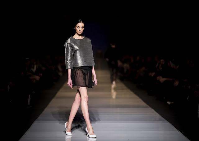
TOMAOTOMO - MIRRORS
Tomek Olejniczak’s show, was the first one, which I had an opportunity
to attend on Saturday and I have to admit, that this collection totally
bewitched me! Some people said that the collection is not really
surprising and is a copy of La Mania and Bohoboco. I personally really
admire Tomek for his consistency in his project and the style. Once
again he put on the ultra-feminine silhouettes, but this time in a bit
more extravagant than before…and it is due to cuts and deep necklines.
Additionally, there was a majority of very long dresses, but also the
lace shorts and some interesting jackets. Mirrors collection is
maintained in beige, white, shades of olive. What is more, clothes were
decorated with small, golden plates (what explains the name of the
collection “Mirrors”). These designs seem to be dedicated to
self-confident, aware of their attractiveness women, but simultaneously
sensual ones.
* * * * * * * * * *
Pokaz Tomka Olejniczaka „Mirrors” był pierwszym, który miałem okazję
zobaczyć w sobotę i muszę przyznać, że kolekcja mnie oczarowała!
Niektórzy stwierdzili, że kolekcja jest za mało zaskakująca, jest kopią
La Mani i Bohoboco. Podziwiam Tomka za konsekwentność w swoich
projektach i ich stylu. Jak zwykle postawił na ultra-kobiece sylwetki,
jednak tym razem w nieco odważniejszym wydaniu…a to za sprawą rozcięć i
głębokich dekoltów. Dodatkowo, przeważały bardzo długie suknie, ale
również koronkowe szorty, czy ciekawe żakiety. Kolekcja „Mirrors”
utrzymana jest w odcieniach beżu, bieli czy oliwki. Co więcej, ubrania
zostały ozdobione złotymi blaszkami (co tłumaczy ‘lustrzaną’ nazwę
projektów). Kolekcja wydaje się być idealna dla kobiet pewnych siebie,
swojej atrakcyjności, władczych, ale i pewnego rodzaju sensualnych.
FOT. Marek Makowski


FOT. Marek Makowski


MICHAŁ SZULC - VIOLENT COLLECTION
It was the second time, when I had an opportunity to see Michał Szulc’s
fashion show – first time was at the spring edition of Fashion Week
Poland 2012. Then, the collection did not enthused me, although it was
noticeable to see, that Michał is a talented designer and I hoped, that
one time he will surprise me with his designs. And so it happened! His
last show was great! I felt in love with the character of this
collection, especially with the fact, what women’s clothes don’t have to
be binding and must be associated only with evening formal outputs.
Michał Szulc have shown that woman’s personality plays the most
important role and clothes are it’s the best companion. On the catwalk
there were shown jackets, jumpsuits, tops, dresses. Colours – black and
white, through turquoise and cobalt, until gold and silver. Profiles
were generally modest, but we could noticed game of forms of the
clothes, colors and sprint, which deserves a great applause. Especially
patterns gained my liking, without which I cannot imagine any summer
collection! It is also easy to notice, that the designer tries to expand
more values of women, by designing clothes which uncover body. The
icing on the cake of the whole collection were baseball caps, which
appeared on the majority of models, same as sunglasses, what gave more
casual style to the collection. What the woman of Szulc is like?
Perfect, though oversized clothes – still really feminine!
* * * * * * * * * *
Już po raz drugi miałem okazję obejrzeć pokaz Michała Szulca - pierwszy
raz podczas wiosennej edycji Fashion Week Poland 2012. Jednak wówczas
kolekcja mnie nie zachwyciła, chociaż dostrzegalne było to, że Michał
jest uzdolnionym twórcą i liczyłem na to, że któregoś razu zaskoczy mnie
swoimi projektami. Tak było tym razem - ostatni jego pokaz uważam za
rewelacyjny! Bardzo spodobał mi się charakter tej kolekcji, zwłaszcza
to, że kobiece ubrania nie muszą być zobowiązujące i kojarzyć się
jedynie z wieczorowym wyjściem. Michał Szulc pokazał, że to osobowość
kobiety spełnia najważniejszą rolę, a ubranie jest jej najlepszym
kompanem. Na wybiegu pojawiły się marynarki, kombinezony, topy,
sukienki. Kolorystyka - począwszy od czerni i bieli, poprzez turkus i
kobalt skończywszy na złocie i srebrze. Sylwetki na ogół skromne, jednak
widoczna była również zabawa formą i sprintem, która zasługuje na
wielkie oklaski. Zwłaszcza desenie przypadły mi do gustu, bez których
nie wyobrażam sobie kolekcji letniej! Łatwo także dostrzec, że
projektant coraz bardziej stara się pokazać walory kobiety poprzez
odważniejsze ubrania odkrywające ciało. Wisienką na torcie tej całej
kolekcji były czapki baseballowe, które pojawiły się na głowach
większości modelek wraz z okularami słonecznymi, co dodało to całej
kolekcji luzu. Jaka jest kobieta Szulca? Idealna i pomimo oversize’owych
ubrań – nadal kobieca!
FOT. Szamot Lyzab


MMC STUDIO DESIGN
Duet
of Rafał Michalak and Ilona Majer once again did not disappoint me.
Their previous show at Fashion Week I saw only in the pictures, because
I was not able to reach it. But this time there was no other option-I
had to be an observer! It was worth of it! The crowds present at the
show testified only that the spectacle will be outstanding! The whole
show started with an unleashed storm, with darkness in which the models
on the catwalk passed in transparent rain coats. After a while appeared
Joanna Horodyńska (polish ex-model and stylist) in dark make-up mask and
in the pink set. The collection was interesting, mainly because of the
diversity contained in forms and colors, but also mostly because of
omnipresent geometry, which though presented a slightly and soft
silhouettes. Fonts referred to the 50’s. Clothes were feminine and
elegant, despite the inspiration of sportswear. In the collection there
were use of a wide range of materials, such as nylon, jacquard silk and
light organza. Colors vary, but subdued - mainly dominated by gray,
silver, snowy white and black, but also limon, beige or yellow. I
especially liked silver coats a la tailcoat, which were presented on the
models very perfectly. See-through blouses, draping on pants and a lot
of subtle nudity. Collection was very consistent - you could see the
perfectionism in every detail. Even the background music would continue
to dominate in the collection. I do not know if the duet of designers
will ever dissapoint me!
* * * * * * * * * *
Duet Rafała Michalaka i Ilony Majer po raz kolejny nie zawiódł.
Poprzedni ich pokaz na Fashion Weeku w Łodzi widziałem tylko na
zdjęciach, bo nie udało mi się na niego dotrzeć. Jednak tym razem nie
było innej opcji-musiałem być obserwatorem! Opłacało się! Tłumy obecne
na pokazie świadczyły jedynie o tym, że pokaz będzie znakomity! Całe
widowisko rozpoczęła rozpętana burza, ciemność w której po wybiegu
przeszły modelki w przeźroczystych, przeciwdeszczowych pelerynach. Po
chwili pojawiła się Joanna Horodyńska w ciemnej, makijażowej masce w,
znanym już dobrze z salonów, pudrowo różowym zestawie. Kolekcja
interesująca ze względu na różnorodność zawartą w formie i kolorystyce.
Jednak głównie przeważała geometria, która mimo wszystko prezentowała
się wyjątkowo lekko na sylwetkach. Kroje nawiązywały do lat 50. Ubrania
wyglądały kobieco i elegancko pomimo sportowej inspiracji. W kolekcji
wykorzystano szeroką gamę materiałów, takich jak nylon, żakardowy
jedwab, lekkie organzy. Kolorystyka różna, aczkolwiek stonowana -
przeważały głównie szarości, srebro, czerń, śnieżną biel, ale także
limonkę, beże czy żółć. Szczególnie zwróciły moją uwagę srebrzyste
płaszcze a la frak, które idealnie prezentowały się na modelkach.
Prześwitujące bluzki, drapowania na spodniach i dużo subtelnej nagości.
Kolekcja ogółem była bardzo spójna - było widać perfekcjonizm w każdym
detalu. Nawet podkład muzyczny idealnie wkomponował się w kolekcję. Nie
wiem czy duet tych projektantów kiedykolwiek mnie rozczaruje!


FOT. Szamot Lyzab


i don't understand the fit of some of the clothes here from tomaotomo, but i like the designs.
OdpowiedzUsuńhttp://halfwhiteboy.blogspot.com/
The designs are amazing...such creativity, I agree with halfwhiteboy on the fit of some of tomaotomo´s garments but besides that...great runways.
OdpowiedzUsuńhugs
Andru
The Black Label
Jak świetnie czyta się Twoje recenzje! Najbardziej do hustu przypadły mi propozycje MMC.
OdpowiedzUsuńMiło mi bardzo :) Zgadzam się, projekty MMC to coś pięknego <3
Usuń